
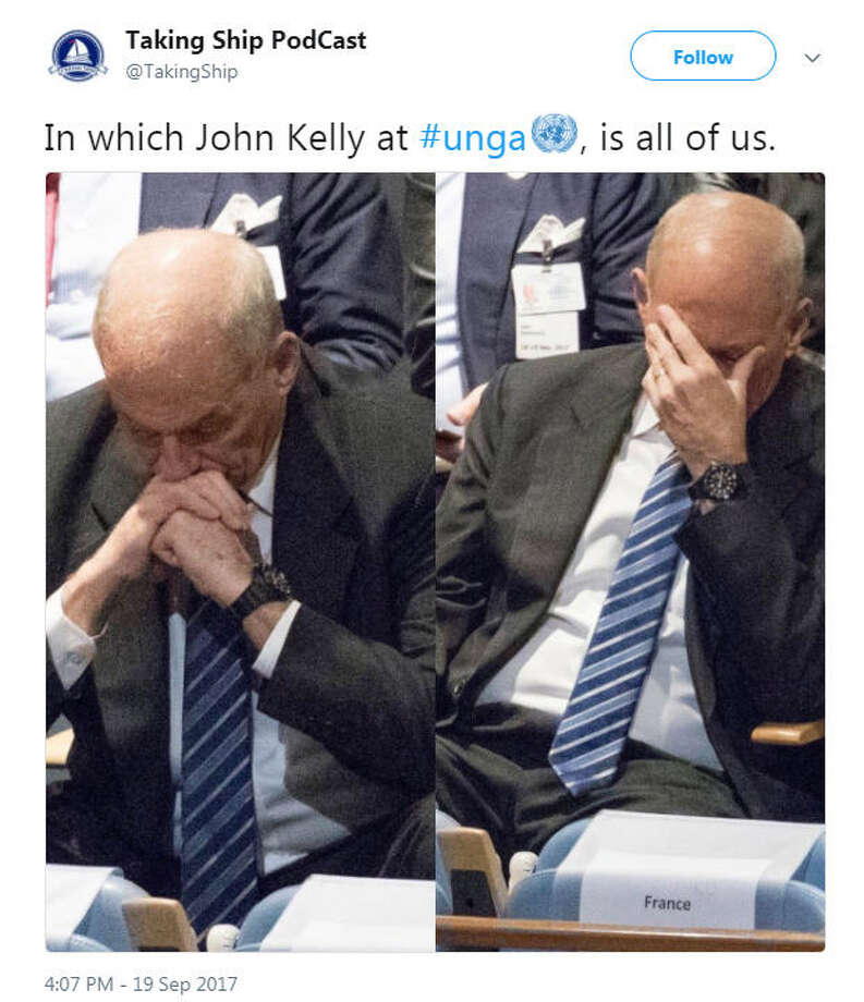
john kelly with his face in his hands in an attempt to hide the fact that he was at the meeting or that physical response when one covers one's face with a hand when one can't believe what they are hearing and seeing. Keep this in mind, john kelly is a drumpf/trump-pence republican, he is as corrupt and rotten as the rest of the administration, if he wasn't he wouldn't be part of it.....
See why Trump tweeted and then deleted this embarrassing photo (we've got the screenshots!)
·

Donald Trump wanted to show he’s a serious man who can hold serious meetings. Nothing says “I’m a serious person” like tweeting out photos of you taking a break from Fox News to attend a meeting where your fellow Republicans explain to you that your trade policies are moronic and ill-advised. That’s the scene in the image below as Donald Trump hosted an “Agriculture Roundtable” where red state senators who are worried about re-election and their farmer constituents tried to get Trump to walk back his tariffs and rejoin the Trans-Pacific Partnership.
In an attempt to prove he actually does occasionally take a break from Fox News and golfing, he sent out this now deleted tweet bragging about the meeting. Here’s a screenshot of the now missing tweet. Jump below to see why he deleted it.

That last picture on the bottom right? Let’s zoom in a little closer.
It appears that Trump has deleted this tweet—the one where, in the last image, you can see John Kelly with his head buried in his palm. pic.twitter.com/ExHgFzGYHH

I made sure to take a screenshot of JUST the photo of John Kelly! pic.twitter.com/Mrr0ls03Bq


A little closer, please.
I made sure to take a screenshot of JUST the photo of John Kelly! pic.twitter.com/Mrr0ls03Bq
I did too! Here’s another one, in case anybody needs it!pic.twitter.com/OB8hUNJDKH


Apparently Trump’s babysitter and Chief of Staff John Kelly cannot hide his embarrassment about the entire meeting.


